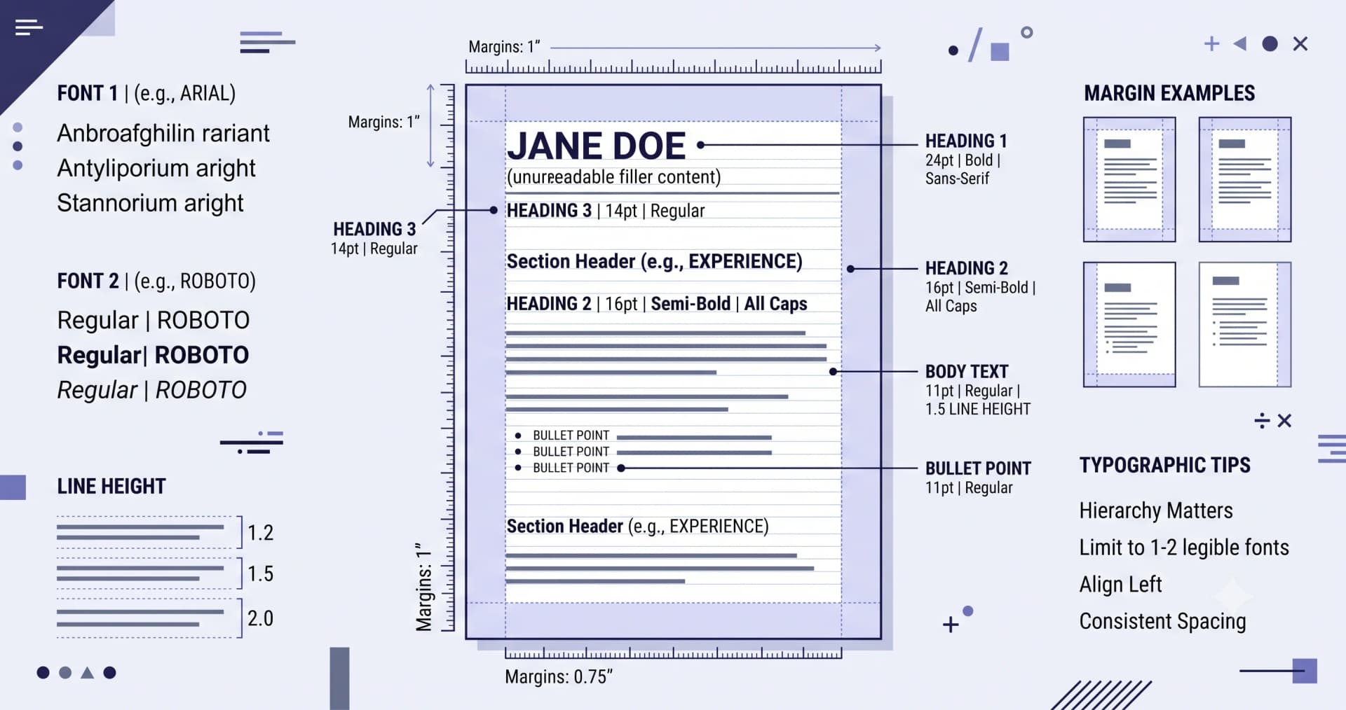
Almost every resume is now read on a screen, often at 60% zoom in a preview pane. That changes what works: contrast and whitespace matter more than the font you pick, within reason.
Fonts that work
Pick one family and use weight, not a second font, for contrast. Two fonts is a design decision that needs skill to pull off; one font with bold headings never looks wrong.
- Sans-serif — Inter, Calibri, Helvetica, Arial, Lato, Source Sans
- Serif — Georgia, Charter, Garamond, Times New Roman (dated but perfectly readable)
Sizes
- Body — 10 to 11.5pt for sans-serif, 10.5 to 12pt for serif
- Section headings — 12 to 14pt, bold, optionally uppercase with letter-spacing
- Your name — 18 to 24pt
- Never below 9.5pt — it's the clearest signal that you're forcing content onto one page
Margins and line spacing
Margins of 15–20mm (0.6–0.8in) on all sides. Line spacing of 1.15 to 1.4. Space between sections matters more than space within them — a resume feels organised when the eye can find where each section starts without reading.
Colour, used sparingly
One accent colour, applied to section headings and perhaps a thin rule. Body text stays near-black (#1e293b rather than pure black reads more comfortably on screen). Avoid light grey body text — it disappears when printed and fails accessibility contrast.
Check it the way it'll be read
- View the PDF at 60–70% zoom — the size it appears in a preview pane
- Open it on a phone
- Print one copy in black and white
- Copy-paste it into a plain text editor to see the ATS's view
The cramping test
If you've reduced the font below 10pt, cut margins under 12mm, or set line spacing below 1.1 to fit one page, you haven't fixed the length problem — you've hidden it. Cut a bullet instead. Whitespace is what makes a page look confident.
Put this into practice
Build, score and tailor your resume with JotCV — free plan, no card needed.
Adjust fonts and spacing live